
Nordic Flow
Breathing and mindfulness app for iOS and Android. Inherited it, redesigned it completely, added features, and connected it over hardware to the chiller controlling the ice bath.
- Role
- Lead frontend — Antártida
- Period
- 2023 — 2024
- Type
- Client work
- Status
- shipped
- 2
- App stores, one codebase
- 5
- Session intents
- 4s / 6s
- The default pacer
- 1
- Ice bath on the other end
Overview
A breathing and mindfulness app with guided sessions, already live on both stores when it reached us. We took it over, did a complete redesign, kept maintaining it and added features on top.
What comes out is wider than a meditation app. One React Native codebase carries the session player, a scored analytics layer, an on-demand class library with collections and instructors, a habit streak, and a storefront selling the cold plunge tubs and accessories the sessions are written for.
The part that made it unusual is that it does not stop at the phone. Some units are paired with an ice bath, and the app talks to the tub’s control board — you set and manage the chiller from the app. That pulled the work into native mobile development and hardware communication, which is a different discipline from shipping screens.
Redesigning a live app is also its own problem: every screen has to change without breaking the habits of the people already using it daily.
Architecture
An app with a tub on the end of it
Scroll to pan
Screens
Modules
The breathing pacer
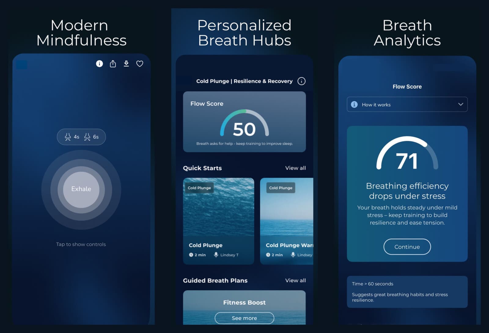
The core of the product and almost the whole screen: a ring that expands and contracts against a set rhythm — four seconds in, six out by default — with the controls hidden until you tap, because the interface competing with the breath is the failure mode.
Intents and streak
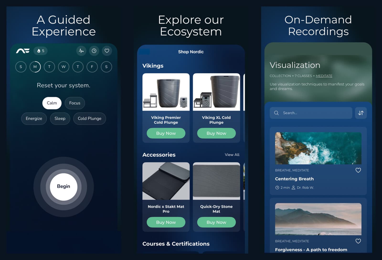
The home screen asks one question — calm, focus, energize, sleep or cold plunge — over a week ring and a streak count, so the daily decision is a single tap and the habit is visible before anything else.
Personalised breath hubs
Each intent opens its own hub: quick starts of a couple of minutes with a named instructor, longer guided plans, and the score for that practice at the top of it.
Flow Score
Breath measurements condensed into one number, a sentence about what it means, and the next thing to do about it — with "how it works" sitting immediately next to the gauge, because an unexplained score is not something anyone acts on.
On-demand library
Collections and classes with instructors, durations, categories, search, sort and favourites — the content half of the product, kept navigable as the catalogue grew.
Shop and ecosystem
Cold plunge tubs, mats and accessories, plus courses and certifications, sold inside the app the hardware is used with.
Ice bath & chiller control
Communication with the tub’s control board so the chiller can be driven from the app — native mobile work and hardware connectivity rather than pure UI.
Complete redesign
An inherited, live application rebuilt visually and structurally without disrupting existing users, then maintained and extended.
Engineering
Redesigning an app people already use every morning
An inherited product with daily users has no blank slate. Every screen changed, but the muscle memory underneath it could not: where the session starts, how many taps to the thing you did yesterday, what the streak means. The interesting constraint is that the users who care most are the ones most likely to be broken by the redesign, and they are also the ones who leave reviews.
The pacer is judged against the user’s own body
Most animation in an app is decoration and nobody times it. A breathing ring is different — someone is inhaling along with it, and if the ring and the four seconds it claims disagree, they feel it immediately and stop trusting the app. That turns a visual component into a timing one, which is a different set of decisions on a phone that is free to throttle, background and interrupt whatever is on screen.
A score has to be explainable to be useful
Turning breath measurements into a single number is the easy part; making it actionable is not. A bare 50 tells a person nothing, so the score ships with a sentence about what it means, a threshold to aim at, and a "how it works" disclosure inches from the gauge. The product decision underneath is that a score nobody understands is worse than no score, because it looks like information.
The app is also a remote control
One of these installs sits next to a tub full of ice, and the phone is what sets the chiller. That means native modules and hardware communication in a codebase otherwise made of screens, and it means cold plunge lives on the home screen as a session intent alongside calm and sleep — the hardware is part of the content model, not a device settings page bolted onto the side.
Stack
- 01React Native
- 02TypeScript
- 03iOS
- 04Android
- 05Native modules
- 06Hardware integration